A complicated checkout process can frustrate customers and lead to lost sales. That’s why Shopify has introduced a one-page checkout—making transactions faster, easier, and more efficient.
Previously, Shopify used a three-page checkout system, but now, everything is condensed into a single page, reducing friction and boosting conversions. With fewer steps, customers can complete purchases quickly, leading to a smoother shopping experience.
In this article, we’ll explore Shopify’s one-page checkout, its benefits, and how it can optimize your store’s sales.
Let’s dive in!
What Is Shopify One Page Checkout?
Shopify’s one-page checkout is a streamlined and user-friendly process allowing customers to review their orders, shipping information, and billing information on one page.
This means that every customer when they confirm their buying option, can complete their transaction from a single window to review their orders, addresses, discounts, rewards, and billing.
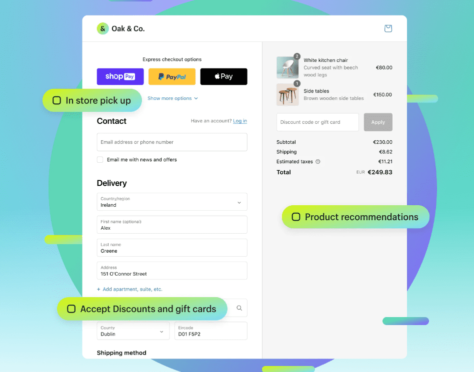
The Shopify one-page checkout is best optimized for speed and conversion.
Its efficiency and velocity drive high conversion because customers have the best shopping experience ever and want to return for more. Fewer steps, less hassle, more customer satisfaction!
The layouts of one-page checkouts are different from the three-page checkouts! The three-page checkout was divided into 3 individual pages, each consisting of the following information.
- Personal info: Name, email address, and phone number.
- Shipping Information: Shipping address.
- Payment information: product details, discount code, total price.
However, in the updated one-page checkout, all information is condensed into one page, making it easier for customers to complete their payment.
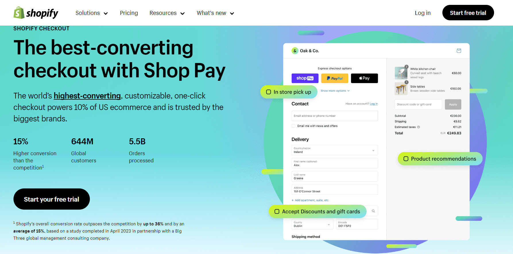
Benefits of One-page Checkout Over Three-page Checkout
As mentioned, since the three-page checkout is condensed into a one-page checkout, there are many advantages of the latter. Let’s analyze some of the benefits.
1. Shorter And Faster Checkout
Compared to the three-page checkout system, the one-page checkout system is relatively easy, short, and fast to complete. Fewer page loads, instant display of shipping rate and billing address, and faster transactions all contribute to its efficiency!
Since the one-page checkout is optimized for conversion and efficiency, it can be used to increase the rate of repeat customers, thus increasing brand loyalty.
Witness the magic of the wicked-fast checkout process in the video below.
2. Enhanced User Experience
Since the one-page checkout is incredibly fast, your customers only need fewer clicks with reduced friction to finish buying—all within a single page. This also reduces the abandoned cart issue since the checkout process is narrow, and customers can easily navigate to the transaction!
The easier the steps, the better the user experience.
3. Intuitive Design And Drive High Conversion
The Shopify one-page checkout is highly intuitive and optimized for conversion due to its reduced friction between the customer and the merchant.
This feature is highly inspired by the earlier feature of Shopify, “Shop Pay,”— the most trusted digital wallet on the Shopify platform.
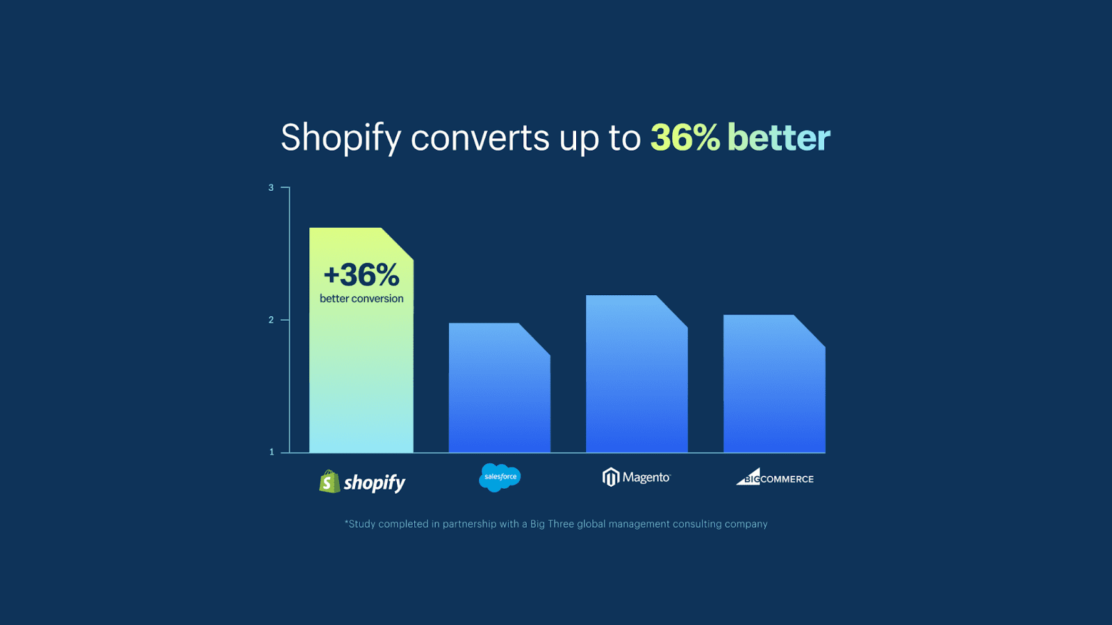
Statistics show that Shopify has outperformed its competitors by 36%. Due to Shop Pay, there is a reduction in the process for guest checkout options that allow new customers to finish a purchase without even creating an account.
This, too, gives rise to exceptional brand loyalty.
4. Highly Scalable
Though it may seem simple, the Shopify one-page checkout can handle up to 100000 checkouts per minute. The platform is secure, reliable, and fast. Therefore, the efficiency of a one-page checkout is purely imaginable. That’s the power of having an express checkout.
5. No Long Scrolling
When I first discovered this feature, I was concerned that a one-page checkout might have a long list of customer information that looked like a grocery list. But, this misconception is normal since a three-page checkout is condensed into a one-page layout. And Shopify cleverly solved this problem.
They automatically rolled up the filled sections with a heading, thus making space for the next one. This is quite easy to navigate, especially when a new user is at the checkout.
The best part about the Shopify checkout process is that it allows customers to choose between a one-page and three-page checkout. Below, I have explained how to activate the one-page checkout process for your Shopify store.
How To Get One Page Checkout On Shopify In 6 Easy Steps?
All Shopify merchants can access the one-page Shopify checkout. This feature is accessible to all Shopify plans, including Basic, Shopify, and Advanced plans!
Here are 6 easy steps to activate your one-page checkout!
Step 1: The first step is to log into your official Shopify account using your user credentials.
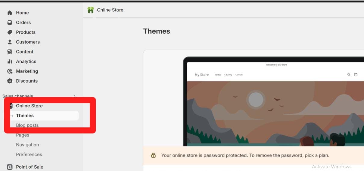
Step 2: After logging in, your admin dashboard will appear, and you will see the Theme option below. Click the theme option.
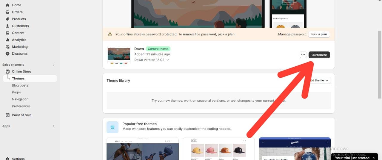
Step 3: You can see the Customize option on the page after clicking the themes option. Click on customize.
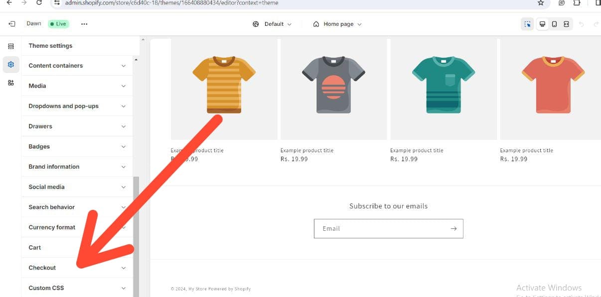
Step 4: Now, there is a Settings icon on the left side of the page. Click the icon and go to Checkouts.
Step 5: Scroll down the sliding bar to find the Checkout Layout option. Click the option, and you can switch between a three-page layout and a one-page layout, as shown below.
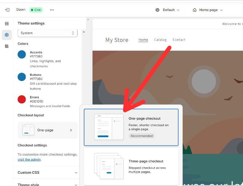
Step 6: Click the one-page checkout option. Then click the Save button at the top right corner of the page, as shown below.
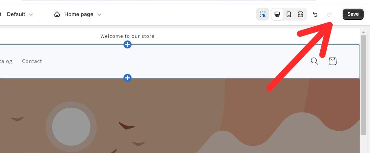
That’s it. You’re done! You have successfully changed the checkout layout. You can switch the layout at your convenience.
If you want the three-page checkout layout back, you can follow the same steps and change it to the three-page layout option.
This one-page layout can ease your customer’s transaction process. But as always, there’s a negative side to every circumstance; there are some cons of using the one-page layout, too.
Pros And Cons Of One-page Checkout
One-page checkout is functional, easy to navigate, and drives high conversion. Let’s look at some of the pros and cons of this Shopify feature.
Pros
- Reduces the number of pages the user goes on before payment.
- Short, quick, and efficient payment processing.
- Best-in-class customer experience.
- Increased conversions.
Cons
- Relatively increased page length and scrolling.
- Reduced upsell and cross-sell opportunities.
- It may impact load speed.
Some Related Reads:
Conclusion: Shopify One-Page Checkout Is Good for Users
The Shopify one-page checkout simplifies the transaction process, enhancing speed and user satisfaction. While it may have some drawbacks, such as reduced upsell opportunities and potential load speed issues, these can be addressed with strategic adjustments.
For merchants, the one-page checkout is an excellent tool to experiment with and adapt based on customer feedback. It’s a win-win for both customers and store owners, providing a streamlined, efficient, and user-friendly shopping experience.
How easy was it for you to set up a one-page checkout? Let us know in the comments below!
FAQs
Shopify’s one-page checkout lets customers complete their purchases on a single page, reducing friction and speeding up transactions.
The three-page checkout splits personal info, shipping details, and payment into separate pages, while the one-page checkout combines everything into one.
It speeds up transactions, improves user experience, reduces abandoned carts, and boosts conversions by making the process simpler and faster.
Yes! The one-page checkout is available for all Shopify plans, including Basic, Shopify, and Advanced.

